App

Stocks

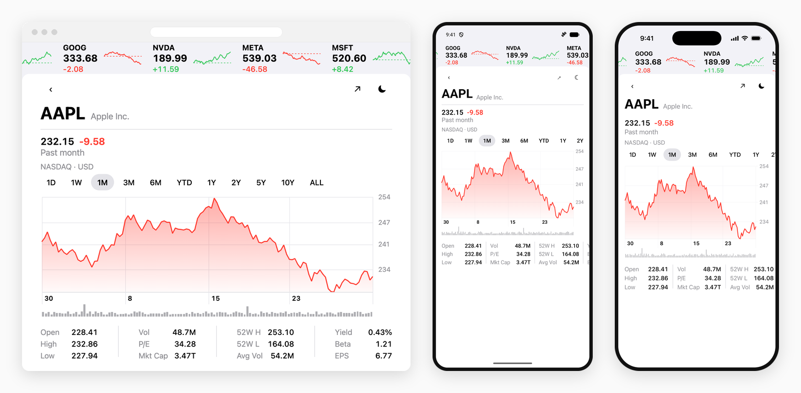
A quote sheet in the shape Stocks' has: a ticker tape above it, a price ladder down the trailing edge, and a plot with a grid behind it, a row of dates under it and a volume tape under those. Where the other studies put chrome around a plot, this one puts chrome on one — and every piece of it has to line up with the marks to the pixel while none of it is drawn by the chart.

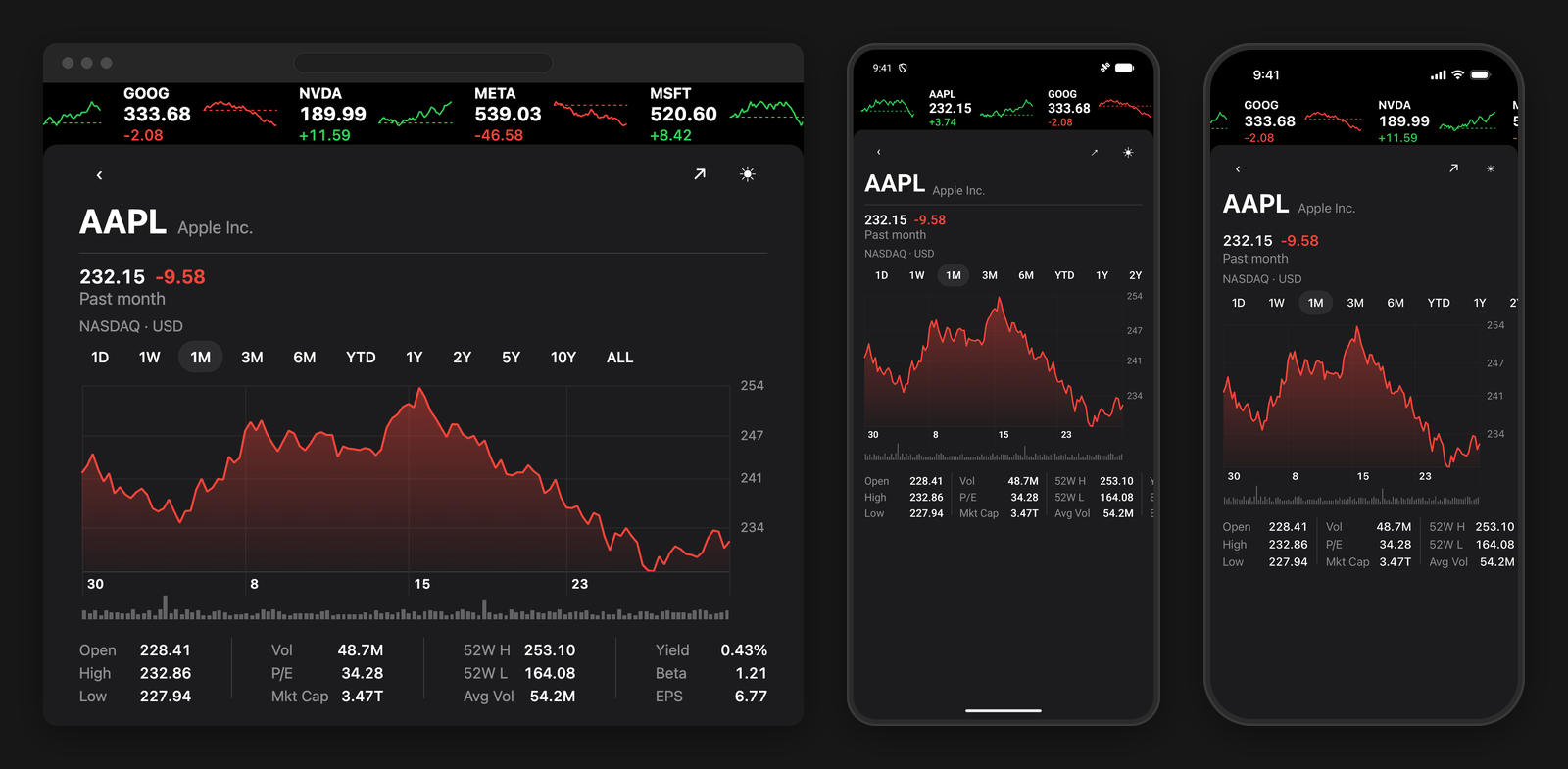
The Stocks-style quote sheet running on the web, on Android and on iOS, side by side
One trace, three renderers, in the appearance you are reading this page in — the grid, the dates and the volume tape all placed off marks the chart measured and nobody drew.

Measuring the plot box

Everything laid against the plot needs to know where the plot is, and the reported rect is not the same number on every renderer: the web bakes the axis padding into it, the native ones keep it inside the frame. The price ladder makes it worse — it takes a gutter off the trailing edge whose width depends on how many digits a price has.

So the chart carries a handful of marks nobody draws. A hidden annotation is still measured and still reported in geometry, and an annotation lands where its data lands on all three renderers — which makes a mark at a known coordinate the one exact answer to where that coordinate is on screen.

tsx
const edge = (id: string, category: string, value: number) =>
  annotation.point({ hidden: true, id, size: 0, x: category, y: value })

// One at each dated tick along the floor, one at each price rule on the leading edge,
// and one in the far corner that closes the box.
const annotations = [
  ...range.axisTicks.map((tick, index) => edge('col-' + index, categories[tick.index], domain.min)),
  ...priceTicks(domain).map((value, index) => edge('row-' + index, categories[0], value)),
  edge('col-end', categories[categories.length - 1], domain.min),
]
tsx
// Read back off the layout the chart reports, and the grid is exact on all three.
export const plotGrid = (geometry: ChartGeometry | null) => {
  const at = (id: string) => geometry?.annotations.find(item => item.id === id)
  const columns = [0, 1, 2, 3].map(index => at('col-' + index)?.x)
  const rows = [0, 1, 2, 3].map(index => at('row-' + index)?.y)
  const corner = at('col-end')
  if (!corner || columns.some(value => value === undefined) || rows.some(value => value === undefined)) {
    return null
  }
  return { columns: [...columns, corner.x], rows: [...rows, corner.y] }
}
Those numbers are in the chart's space, not the screen's. The view the rules are placed in has to be the chart's own box — put the screen's gutters on its parent instead, or every offset is a gutter out. It is the same calibration the scrub overlay needs, for the same reason.

The rules themselves are views rather than annotations, twice over: an annotation is drawn over the marks, and a grid over a trace reads as a cage around it — and the columns carry on past the plot's floor to divide the dates underneath, which is not a thing a chart can be asked for. The volume tape below is views for a third reason: it has to line up with the plot to the pixel, and two charts never do, since each renderer insets its own plot by a different amount.

What the chart is asked for is the box itself. Both axes name their plot-dimension paddings as 0, which replaces each renderer's own reserve with the same number and runs the trace corner to corner the way a quote chart's does; the price ladder is an axis.end that draws no rules, because the rules are the screen's; and plot.clip is off, so the trace reaches the floor and the dot under a finger can hang past it.

A span the chart paints

One finger takes the trace whole: it turns the reading colour, and nothing steps back — a dimmed line under a crosshair reads as disabled when there is only one line to dim. Two fingers are a different reading, and that one the chart paints itself: the stretch between them in its own direction, green if it closed up and red if it closed down, with the rest of the period behind it.

tsx
const scrubbing = interaction({
  crosshair: 'x',
  crosshairStyle: { color: color.scrub, width: 1 },
  // One trace takes the reading colour whole, so there is nothing for a dim to mean.
  dimOpacity: 1,
  haptics: true,
  hover: 'nearest',
  marker: marker.point({ color: color.scrub, size: 15 }),
  range: true,
  // The held stretch: its own direction, its own dim for everything outside it, a dot at each end.
  rangeStyle: { color: color.up, dimOpacity: 0.32, dot: true, downColor: color.down },
  tooltip: false,
})

Nothing about a held span reaches the props, so a span moving costs no chart at all — the ends are drawn from the fingers by whoever is drawing the line. What crosses into JavaScript is only what the row above the plot writes: the two dates, the delta and the percentage, which sit still.

The dot under one finger is web-only here. The web's scrub overlay draws the crosshair and skips a 'point' marker, so the reading would have a line and no mark. It gets an annotation.point with a halo instead, on the web alone — on iOS and Android marker.point is already drawing it.

Nothing else moves. The animation is off in all three of its parts: the sheet opens on a price that is already true, and a tap on another range is a request to see that range, not to watch a month become a year.

tsx
arrival: animation({ enabled: false, initial: false, updates: false })

What it uses

PropTypeDefaultDescription
Chart.Linefeature-charts/stocks-chart.tsxThe price trace: a fill that gathers under the line and lets go of the floor, no time axis at all, both plot-dimension paddings named 0, and the marks allowed out of the plot.
annotation.point({hidden})feature-charts/stocks-chart-style.tsMarks nobody draws, measured and reported in geometry. The grid, the row of dates and the volume tape are all placed off where they landed.
axis.endfeature-charts/stocks-chart-style.tsThe price ladder in a gutter on the trailing edge, four rules down from the high and evenly across the data — a ladder is read as distance from the extremes, not as a decimal scale. It draws no grid of its own.
interaction.rangeStylefeature-charts/stocks-chart-style.tsThe held stretch in its own direction with the rest of the period stepped back behind it, drawn from the fingers so a span moving costs no re-render. Separate from dimOpacity, and it reaches the area fill too.
marker.point · halofeature-charts/stocks-chart-style.tsThe dot under one finger: the marker on iOS and Android, and a haloed annotation on the web, whose scrub overlay draws the crosshair but skips a point marker.
Chart.Linefeature-charts/stocks-ticker-spark.tsxOne line per row of the tape with the opening level dashed across it. A line rather than Chart.Sparkline, whose axes cannot be turned off — its web props carry none at all and iOS defaults both to drawn.
useChartScrubapps/example/use-stocks-readout.tsOne finger's price and date, two fingers' delta and percentage, and the plot geometry everything on the plot is placed from.
Platform filesstocks.ios.tsx · stocks.android.tsxOne screen per platform: SwiftUI through @expo/ui on iOS, Compose on Android, React Native on the web — sharing the data, the theme and the chart.

Split the way the other studies are: the chart, its style, the theme and the generated prices are the shared packages/feature-charts package, and the screen around it — in the example app — is one file per platform. apps/example runs it on a device with yarn ios:example or yarn android:example.

A study, not a product. The screen is built to test the library against a design people already know by heart. It uses generated data, and it is not affiliated with or endorsed by Apple.